
CXC Home | Search | Help | Image Use Policy | Latest Images | Privacy | Accessibility | Glossary | Q&A
Logarithmic Versus Linear Scale Models of the Electromagnetic Spectrum
The model of the electromagnetic spectrum pictured at the top of the previous page is used extensively in textbooks and on posters, and like all other models it contains distortions. The model is extremely useful for showing the frequencies of the different bands of electromagnetic radiation (EMR), and the relationships between frequency and wavelength. However, this is a logarithmic scale, and severely distorts the actual width of the different bands of radiation. The result is that looking at this model gives you the wrong idea that the radio band is very large compared to the X-ray band, for example. You are going to construct both models, logarithmic and linear, on the same chart and compare the two scales.
- Tape four pieces of 8 1/2" by
11" paper together end-to-end so that their long sides are on the bottom.
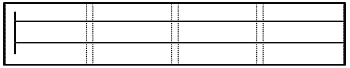
The pieces of paper should overlap by 3 cm. Then draw a line down the left side
of the chart about 2 cm from the edge (see diagram below). From the line you have
just drawn, draw two horizontal lines extending to the right across the pages:
one line 8 cm from the top of the chart, and the other line 10 cm below the first
horizontal line (see diagram below).
- The top line will be used to plot the logarithmic scale. Along this line, mark off 24 1-cm intervals from the vertical line you drew. Starting at 1 cm, label each interval with increasing powers of ten, from 101 to 1024. These numbers represent the frequency in Hertz of the electromagnetic spectrum. Use the information from the Frequency Range Table on the next page to divide your scale into the individual bands of electromagnetic radiation. (Use the entire visible band, not the individual colors.)
Revised: March 07, 2008