Visualizing the X-ray Universe: Stories About Science
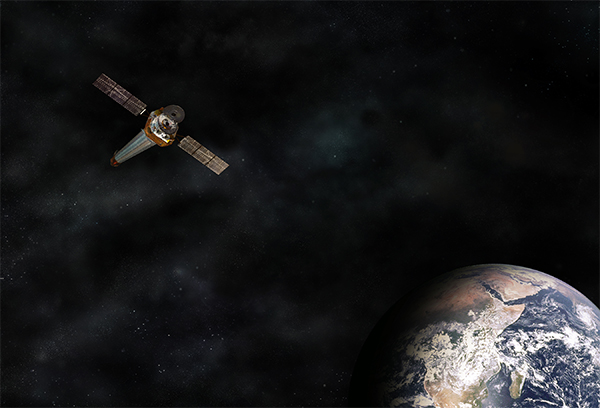
Telling a story about science can come in many different shapes, from an image of the area around a black hole, to a three-dimensional model of the remains of an exploded star, to something as simple as a tweet about a planet. Working for the Chandra X-ray Observatory, one of NASA's “Great Observatories” that studies extremely hot regions in space such as colliding galaxies and neutron stars, there is no shortage of data to tell stories about. Chandra orbits about 1/3 of the way to the Moon so it can take long exposures of cosmic objects. This year, Chandra marks its 15th anniversary of science operations out in the cold, dark and somewhat dangerous void of space.
Perhaps 50% of the job of “visualizing the X-ray Universe” is figuring out how we need to look at Chandra’s X-ray data and asking ourselves: what questions are this data trying to answer? what do experts see in this data? how will non-experts view and understand the data? The remaining 50% of the job is then what to do with that data, to make it both accessible and understandable.

Data Challenges
When looking at the Universe in X-ray light, it’s all about making the invisible into something visible. Human eyes evolved to see and make sense of so-called visible light, but visible, or optical light, makes up a small percentage of all the available light in the Universe. The other task, when looking at the Universe in a different type of light such as X-rays, is to help make the concepts of high-energy astrophysics relatable for readers with all kinds of different knowledge bases.
Astronomy is fortunately blessed with a wealth of data to work with. Professional astronomers have many different kinds of observatories and telescopes to utilize. These telescopes look at many different kinds of light or different kinds of objects. There are also many astrophotographers and amateur astronomers working on the ground. So we have terabytes upon terabytes of information to sort and analyze. Of course, the Universe is unimaginably big, so we need all of that data to try and figure things out.
One of the biggest challenges in telling these stories then is how to make meaning out of so much data. And we need to figure out how to communicate that meaning in a transparent way.
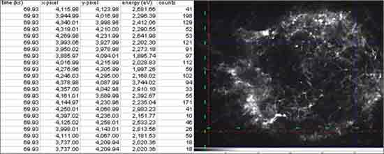
The type of images we create or work with are not created with the click of a camera like a great big selfie of the sky. It’s the result of a process of translation. A CCD in the telescope records the photons (or packets of energy), and the 1s and 0s are sent down to Earth. From there, they’re processed into an events table, and then translated into a visual representation of the object (see events table and image of Cassiopeia A, below). The next step is to turn the image from black and white into color.
There are many human steps in there, and we each have bias. We are making many choices, decisions, along the way. Our aim in all of this is to increase the information quotient of the image, by adding color for example to pull out scientific details we could not otherwise make out visually. But we are still making a series of choices.

Adding Context
It takes a lot of time to collect those high-energy photons that Chandra detects – more time than it does for the Hubble Space Telescope to make an image, for example – because there are fewer of them being emitted from most of the Universe. Sometimes the visual representations of the X-ray data are more abstract or esoteric looking. The results are perhaps not as recognizable an object to us. We are more familiar with, say, a visible light view of a planet or galaxy. For many, a more exotic-looking nebulous structure doesn’t necessarily communicate that this is an image of space.
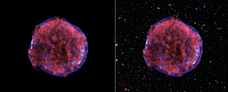
How do we anchor the necessary information in a context that makes sense for our audiences? One thing we can do is to add data from a different wavelength, such as optical or infrared, that does have a more recognizable shape. This adds an extra layer of information.
We may start off showing the remains of an exploded star that, if seen alone, might resemble something from a microbiology class. But then you include the optical star field of that same area of the sky to the X-ray data and our brains can more immediately understand, this is a celestial object. One important corollary to this is that we always make sure we are transparent as possible with whatever we do to create the image. On the Chandra web site for example we have a “build a bear” like function, a simple script that lets the visitor see and click through the individual layers of data that were collated into the resulting image.

But again, the parameters around what to include or exclude are always based on: what is the science? what is the story? what might people see, ask or question when they see the result?
Experts vs Non-Experts
To further help us understanding our audiences, and study how best to tell a science story through images and text, we have been running a research program called "Aesthetics & Astronomy" that studies the perception of astronomical images and their captions across the novice-expert spectrum of users.
We’ve learned that, starting with visual processing, what an expert sees when looking at an astronomical image is not necessarily what the novice sees. The expert tends to move from the astronomy first to aesthetics last – e.g. first he or she is commenting on what kind of data are in the image, what is meant to be shown, then the expert moves on to statements such as “this is pretty cool” or “that’s a lovely image of a galaxy”. In our studies, we’ve seen that the non-expert often moves from aesthetics to astronomy. For example, he or she might start with, “wow, that’s beautiful” and “intense and colorful” before eventually questioning “what does it mean?” “what does a scientist see when he or she looks at this?”
So, novices might begin with a sense of awe and wonder, and focus first on the aesthetic qualities of the astronomical image being shown. Experts, however, often will first inquire how the image was produced, what information is being presented in the image, and what the creators of the image wanted to convey.
Another area where the experts and non-experts differ is in color. Not many non-experts consider blue to be hot. But scientists often do. Because of this, experts tend to visualize blue as hot and red as cool in the making of an image. In contrast, about 80% of novices see red as hot compared to 60% of experts. We’ve never heard a parent say to his or her child “Don’t touch that, it’s blue hot”. So when you have an astronomical image that shows hot material around a galaxy, do you color that hotter area blue or red? The primarily red image might actually convey the information of the object better even though its color mapping would be considered non-standard for a scientist (for example, see below for blue and red versions of galaxy NGC 4696).

To sum up, astronomy images are not like a snapshot from an iPhone. Everything we see in these images is real, but the data have to be translated into the image through a series of steps. How a telescope "sees" is very different than how our human eyes work. Modern telescopes give us super-human vision that enable us to explore the Universe in ways unimaginable just a few decades ago. In most cases they literally make the invisible visible and help us tell better stories about the science.
Note: This blog originally appeared at Innovation Insights on May 29, 2014
-Kim Arcand
Visualization Lead, Chandra
